Wimbledon
Rebrand
Developed a core element for Wimbledon that became one of the most visible components of the tournament’s visual identity.
Designed to operate across print, broadcast and digital platforms, the element established a recognisable motion behaviour that could scale across multiple touchpoints.
As part of the wider system, the work contributed to a cohesive and impactful expression of the brand throughout the tournament.
Client: The Championships Wimbledon Studio: DesignStudio Role: Motion Designer/Animator
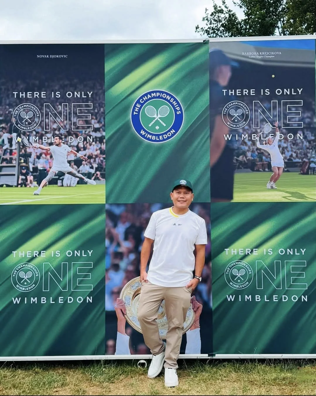
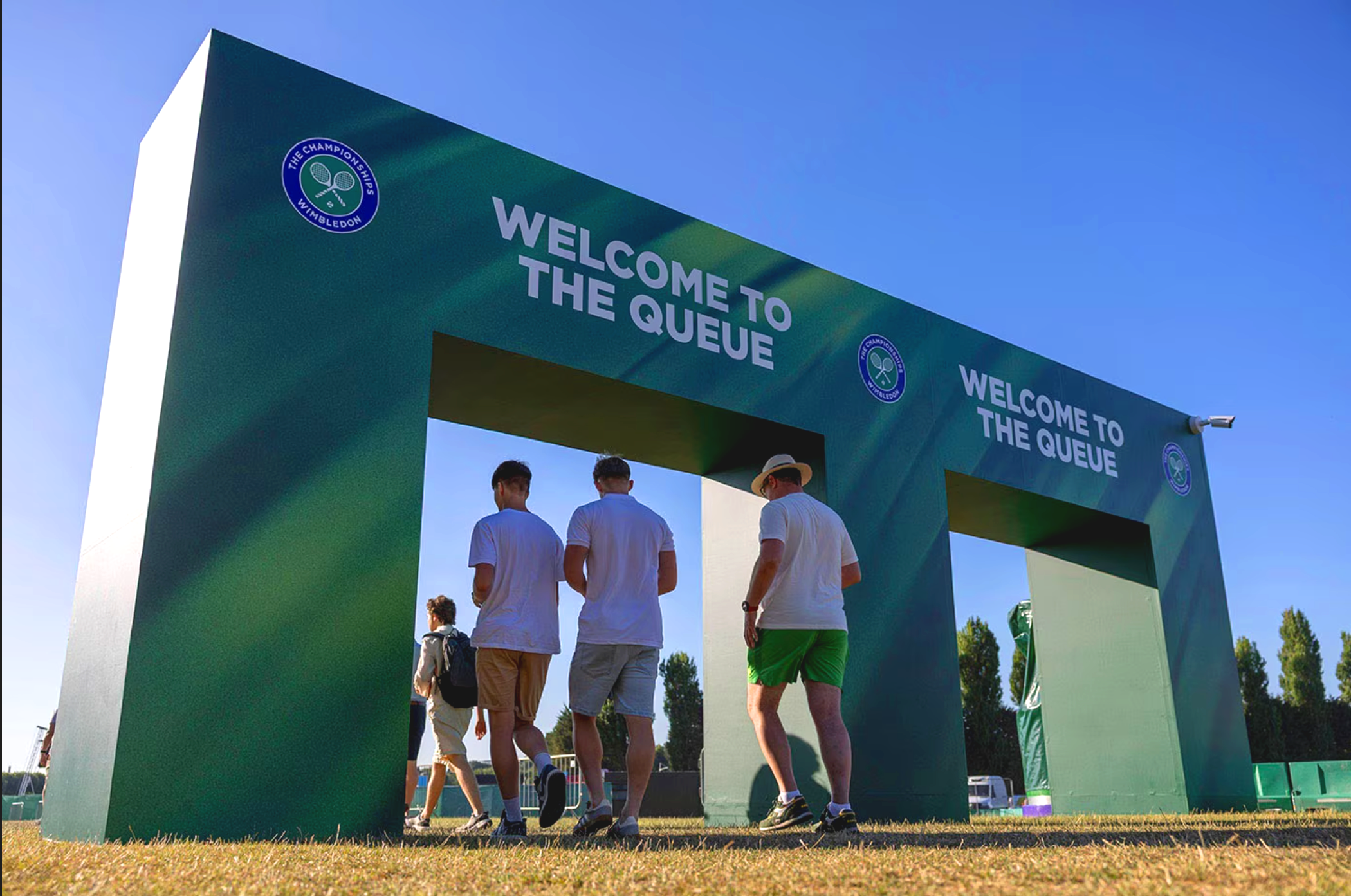
A few shots of how my visuals came to life across the event space


Exploration on two concepts, one the image of grass at a monumental scale and the court lines as a system of visual language.


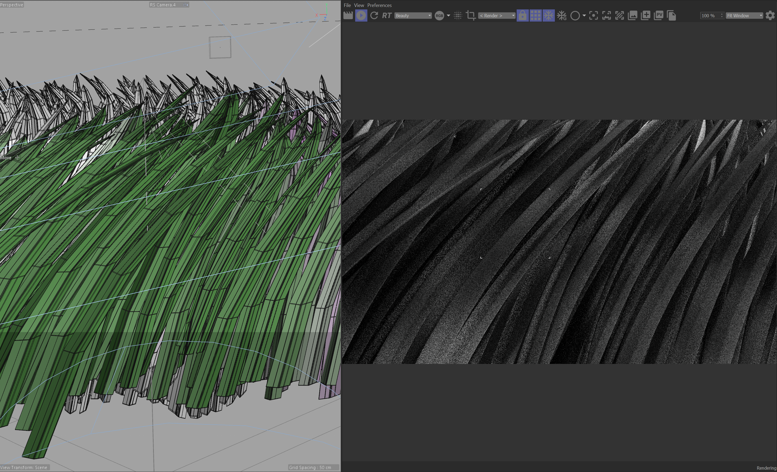

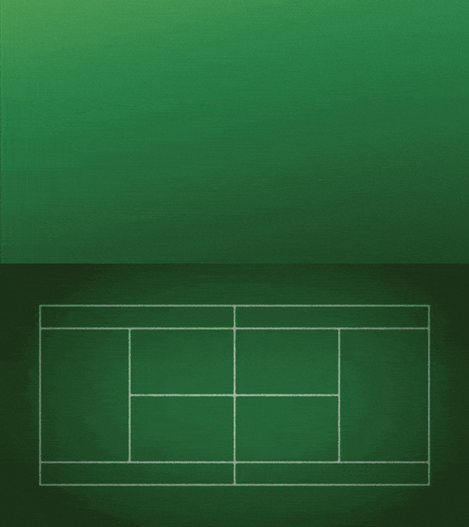
An exploration phase focused on testing, adjusting, and discovering